Wednesday, May 11, 2011

Self Portrait and Blog


I selected these inspiration pieces because they were 3 of the 4 self portraits I found at Albright Knox Art Gallery on Sunday.
I select this media to create my self-portrait because the photograph of Corwin gave me some idea and it seemed like fun to play around with on photobucket.
 When creating the self-portrait  I had a hard time finding self portraits, but found 4 of them, one of which came from the store and not the display. I could not log in to photobucket because I could not remember my password. I tried many times and finally figured it out. I then could not attach the slide show to blog because the ad kept popping up and I could not figure out how to remove it.
This piece represents me by revealing the mood I have been in trying to complete this course and fighting allergies, giving the puffy eyes that look almost closed. I also was in my pajamas as I have been so much, working on these projects the last two weeks.
The elements and principles of art did  in this work is value (the black and white mood), circle shape, center photo emphasized, balance with even amount on all sides of the middle.
I did enjoy working on this project except for the lack of more time to experiment longer.
I think my final artwork is pretty good considering I have never done anything like this before. I always like oval and circle frames verses square ones, hence the circle photo.

AED reflection

It is not just paint and paper, it is music, dance, fashion, and anything else someone does to create and display their emotions is what I said in my first blog about art. I feel the same way only I have seen more ways to express these emotions after taking this course. I also learned the reasons why the art works look like they do and are able to analyze them more like a critic and not just a passerby.
My favorite artists in the beginning was Thomas Kinkade and Monet, now it is not necessarily them, but many others. I have been exposed to so many styles of art that I enjoy more of a variety. I still steer towards the more subtle colors like Monet, and outdoor scenes like Kinkades, but do appreciate other artists like Renoir.
I feel the same way about taking an online course as I did at the beginning. I do enjoy them for the convenience, just miss the camaraderie of student and teacher interaction.
I am signed up to take three online courses this summer to finish my path for a Bachelor Degree.

Tuesday, May 10, 2011

Peer Criticism on Art Curator Project

Viewing several of the classmates art curator projects was fun and educational. I realized how much people relate to nature, the most popular theme for the power points. I narrowed it to these three to review; KROLEWICZ_Project5.pptx, about nature, project_4.pptx, about cool blues and WHITE_Project4.pptx about shoes. I chose the Soles for Souls, done by curator, Monica White, because of the unusual yet popular theme. I enjoyed evaluating this one.
 The challenge I endured was not saving the previously viewed projects the first few days. When I went back, they were no longer available on the submission page. I then just made my choice from the new ones and saved the downloads. I like critiquing a classmate’s work. It enables me to compare my work to theirs and check if I am putting enough effort or too much into the assignment. It also shows me the thought process of others and the creativity out there. I would very much like to read what someone else had to say about my project for the same reason and it might bring an idea to mind, I might not have thought of using. I would rate my article about a 9 because I condensed my wording and it was not quite 2 pages. I did not think it was necessary to give too many details, and not be too long. 

Art Criticism Videos

I first watched the Greenburg on Art Criticism: An Interview by T. J. Clark video. It was hard to understand, his slurring and the sound was not very loud. I learned how much he drinks and smokes, in between each inhale came a sentence or two. All I heard was about how one has to argue the point to critique art. The Greenburg on Polluck: An Interview by T.J. Clark was a little better. I learned about the “death of easel painting” and murals and they were away from containment with boxed edges.
An Introduction to the Italian Renaissance was my favorite. it explained most of the artists we had learned about and their contributions to the art world in a brief and entertaining way.
The Critics-Stories from the Inside Pages was about how critics get media artists to think. They keep the artists on their toes. The subjective (criticism) and objective (reporting) is what it is all about. This requires logic, emotional support and personal credibility. The theory; knowledge, comprehension, application, analysis , synthesis, and evaluation were all explained in this video. To become a critic one must learn to write and start at the bottom.
The Jackson Polluck: Michael Fried and T. J. Clark in Conversation video went into depth of the historical role of modern art and the independence of its aesthetic meaning. One would have to agree on the description in order to agree/disagree on the characteristics to criticize fairly.
The Colonial Encounter: Views of Non-Western Culture was about Dahome Art and Barbarism. The shark was the symbol to protect the shore and mud houses were of the African culture. This video explained the Algerian exhibit at the 1900 Worlds Fair and used the word “indigenous” many times.
The video on "stories from the inside pages" may help and be useful in my criticism, but not the others. I may somehow use the information and not realize it until I am actually writing my critique.

Wednesday, May 4, 2011

Art Curator Project #4

Art curator blog
After I tried to log in to Art stor with no success, I surfed the AskArt site. I decided on women artists as my theme, with “female artists making history” as the subject matter. Hours later I now have a few art pieces for my first blog. 
I attempted to again log on to the ArtStor, only after I contacted them by email. The webmaster advised me that I needed to first click on to Butler Library, then register on the ArtStor link. I did it. Now, I searched my topic with endless possibilities. I put several art works on a power point from the VDS resource site and the AskArt site, the only problem, the year was not provided, more research. The ArtStor link gave the year and other information I needed but, I could not figure out how to copy or get the image from that site to my power point, more research.
 After I read the discussion forum, I searched a site on one the classmates used, Artchive. I found some information there, which led me to the National Museum of Women Artists in Washington that I did not know even existed. More time and research.
There was plenty of information on one artist in particular, Georgia O’Keeffe, that I enjoyed reading about and could not decide which piece to exhibit. When I tried to click on a few of the links or images in Google of her works, it would lead me to links or sites that are of sexual references. One page could not be connected by Safari. Then reading  more about her and reanalyzing her art, I realized the intention by the artist, very sexual innuendos.  I included a plate by O’Keeffe that is used in the installation work of Judy Chicago that I also have in my display. Much to my surprise when I read the excerpt about Chicago and the representation on the “butterfly” plates representing the female genitalia. http://www.throughtheflower.org/page.php?p=10&n=2 tell the story of the impact of this historical installation.
I now have to do more technical issues with the hyperlinks for each source. I did not do it right and had to re find them all. I know I put more into it than necessary, it consumed every nite four or five hours, because I would read about each artist to decide which one to use, than search for the right art work. I like variety and wanted one of each genre of art in this display. Time consuming to find a woman artist in stained glass that made history. All the images are not on all sites.  I learned so much creating the power point, not just the technicalities of completing it on a Mac with Keynotes, but the lives and works of 20 women artists. 

Monday, April 25, 2011

Videos on Art Displays

I viewed the required videos in preparation for our project as a curator. The Lowbrow Art video piece was interesting to me on how this term came about and showed the various artists responsible for making this type of art popular. The production of album covers really put this movement out there along with the help of the internet. I learned how unacceptable this kind of narrative art was until about 10 years ago. Juxtapoz magazine gave it worldwide exposure as well. The Pop Tarts knew they can create nude women better than any man can, making lowbrow art famous in Canada and eventually bringing it to the US.
Displaying Modern Art: The Tate Approach explained the method used by the Metropolitan Museum of Art, white walls and chronological order of each art movement, and the 1970’s busy and noisy display. It then revealed The Tate Method of 4 sections used: Landscape/Matter/Environment, Still Life/Object/Real life, History/Memory/Society and Nude/ Action/Body to display the artwork. The biggest controversy being the Monet art piece in the same room as 3 of Richard Long’s work. The Joseph Beusy’s room was a church like atmosphere and the next room full of waste and junk,  showing abrupt transition between displays. Half way thru this video, it went black and I tried clicking onto individual segments with the same result.
The Bones of Contention: Native American Archeology video was informational about the repatriation issue that The Lakota Sioux were always here and did not want scientists history. They did not want any digging up of graves and demanded return of bones to the ancestors. Construction must even be redesigned if it is involving Indian burial grounds. After some changes, studies not only revealed what we know is true with all Americans that the diet and inactive lifestyle leads to diabetes, but skull size indicated amount of intelligence. In the end, it is evident that we all must work together to get results.
The George Eastman House - Picture Perfect video was the most interesting. I did not realize how many artifacts were on display there or just how significant he was in the art world. The video showed the beautiful home here locally in Rochester, N.Y. that is the museum, that also displays the Daguerrotype collection, the first to use light reflective technology. I learned he had 32 patents in his name and discovered 35 mm film with Thomas Edison. This also houses motion picture archives that I was unaware of and the restoration that takes place. I remember the brownie camera and flash cube cameras from the past and always enjoyed photography. I would like to now attend this museum in the near future.
I have not decided on a topic yet for the project and do not know how these videos will play a role in creating the power point until I move along. I am sure somehow this information especially the Tate display will help.

Wednesday, April 20, 2011

Videos on Abstract and Modern Art

I chose the first 4 videos to view because They seemed to be the most interesting to me. The first one Abstract Expressionism and Pop: Art of 50”s & 60”s showed the work of "Action Painters”, and their concepts. Abstract art is physical, sensual and intellectual. The figurative art’s filled space is different than non figurative that is egocentric. Kline did black and whites in the 50’s , Helen Frankenthjaler’s work was feminine and mystical. This video also showed Andy Warhol in depth with his works and posters and badges gave him the name “Father of Pop Art”. I liked the work of Ray Lichtenstein best. The dots used to create the comic book like characters were emphasized and how he did the black outlines with lips half opened to show seduction was very informative.
The next one,  Power of Art:Rothko, explained his work in the Seagram Building, using expressionism, stemming from his childhood, using feelings of human tragedy. His paintings showed assault on rich patrons. He even offered to paint for free if German curator built a chapel explaining the Holocaust.
Uncertainty: Modernity and Art  video was about the abstract expressionist. The Industrial Revolution changed from focus on religion, because there is not one God in our culture anymore,  to work and science values. The response to modern life, uncertainty is the message in modern art. Pop Art used disillusionment, the opposite of what was happening in life to create art work. The Chinese art was among those that changed from their representation to more of the western civilization influence.
Hockney on Photography went in to depth of David Hockney’s life as a painter and photographer, He discovered the Polaroid  camera. To him it is the chemical process of a painting. In the video, they compared a picture of flowers next to the painting, to see which one was more real.
It was very hard to view these videos, they kept crackling and I even tried to replay them. I tried to listen as close as possible to get the facts as I viewed them. They really gave more insight than the text as far as information on the individual artist as well as the modern art in it’s purpose.

Thursday, April 14, 2011

Art project #4 Burchfield Penny Art Center

On Wednesday, I walked through the art center for the first time. I was amazed at the displays there. The Sensory Crossovers- Synesthesia in American Art was the latest exhibit. I could not take pictures, so I tried to uploaded images from Google, I could only find one. Burchfield did not have any pictures on their site. Here is a video I found about the exhibition.
 As I entered the exhibit, the piece, Oriental- Syncronizing in Blue and Green, 1918 Oil on canvas by Stanton MacDonald Wright, used on the brochure, was eye level and centered on the wall. I was very colorful with geometric shapes, using bold lines in a pattern to resemble a music scale. The blue/green colors represent coolness to start  a scale in color. The rhythm of shapes show movement of color comparing it with music.
 I strolled around to the left, continuing to admire the other works with the music/color in art being equivalent theme. My daughter and I were both drawn to the Blues for Charlie Parker by Sam Scott 1988. The acrylic on canvas was approximately 8’ by 4’. The black background gave great value and  was emphasized by the bold bright color arches, splashes, and circle type lines using balance and rhythm  to make this piece stand out.  This piece reminded me of the magic boards that when drawn on, reveal different colors or black paper drawn on with gel pens. It was placed in the center of the wall with a monochromatic beige art piece only about 3’ by 2’ on each side of it. It was placed also across the room from another art work, Musical Notes, that also was done with very bold lines and colors. The music correlation in all the works displayed was enhanced with a display of  Sketches  9 Wagners Music: Abstract (Hieroglyphics) enclosed in a glass case in the center of the room. 
 A Color-Music Expression of an Excerpt from Richard Wagner's 'Prelude to Lohengrin', by Ira Jean Belmont,1933 Oil on canvas, 34 x 36 in. This piece is done with pastel colors that blended in areas  to give illusions of other pictures, like when looking at clouds. My daughter and I saw a face when we observed this work. This picture is in the video, also. The color scale gives movement to the picture, the longer you look, the more you can see different interpretations. 
The walls were painted off white and the lighting was overhead and very bright. The walls did not all go to the ceiling for better light on the art work. In the Sensory exhibit, the movement was spacious and visible from all angles. 
The artworks were similar in theme, different in sizes and color, some were bold colors, others were monochromatic or pastel. They were framed in various wood, metal and color frames. They were identified with a plaque to the side with the information listed  and some had a story about it on a plaque to the other side of it. The proximity of the artwork to each other were one after another along the walls placed far enough apart to observe, but close enough to relate one to the other. The large Blues for Charlie Parker, our favorite, was spotted from the beginning of the exhibition, although it is placed on a wall kind of in another area several feet from where we stood.
The exhibition was organized by the Albuquerque Museum of Art & History, curated by Sharyn Udall, Ph.D., and expanded by Nancy Weekly with art from the Burchfield Penney Art Center and Albright-Knox Art Gallery. The exhibition and accompanying scholarly catalogue provide an unprecedented opportunity to consider synesthesia through the work of some of the 20th century’s most significant artists"luminaries such as Charles E. Burchfield, Arthur Dove, Joseph Stella, Georgia O’Keeffe and Adolph Gottlieb.
I had observed a few other art works that I enjoyed at this attendance to use but thought it was best to stick to one exhibit for this project.

Artists Videos

I chose to watch the videos that examined the works of individual artists. The first one was Matisse and Picasso video. It compared the two to show how opposite they were in their ideas. Picasso was impulsive and born in to a family interested in art, Matisse’s family thought it was scandalous to be interested in art. Matisse painted real images, whereas, Picasso used imagination and memory for his works.
The Dance at the Moulin de la Galette referred to the artist Renoir. His work was done in 2 sizes using idealism and exhibited fun. It was about what happens on Sunday at the Dance Hall. This piece romanticizes the actions and was sold at at a record price.
A Sunday on Ka Grande Jatte, done in 1884, discussed the work created by George Seurat and his use of dots. I was amazed at the results of arranged dots of color in a pattern to create this picture. It revealed that the monkey in the final piece was added to the original after viewing x rays showed no monkey. The video also showed how the original work was just the riverbank, grass and trees. The 48 characters were added and re arranged a little at a time. The painting was about prostitutes. I learned french words that meant flesh or fish, what was she fishing for? and what millions of non blended dots of color can become.
The last video I viewed was Expressionalism. This showed the ideas and techniques used by several artists that influenced many in the future. Edward Munch was pessimistic, Franz Marc was a "Blue Rider", Ernst Kirshner opposed tradition, created "The Bridge” group and Anselm Kiefer used textures and geometrics to create his works, explaining one must have knowledge in history to understand his art.
I enjoyed learning more in depth about the various artists, especially Renoir and Seurat. The text explains only briefly some of the accomplishments, the videos goes into their whole life and art work in detail, as well as their death.

Sunday, April 10, 2011

Mask Project

I finally completed this project that I thought was going to be easy. Creating the mask was the most fun and easiest. I started by viewing the links on Angel, viewed a how to video on marthastewart.com and www.scissorboy.com that would not copy right in the blog. It stated that the tag was broken. I then searched for images and decided I am drawn to the masquerade style the most. I chose the white face mask because of the assymetrical balance of feathers (texture) and the eyes emphasized with glitter color, I also liked the offset of beads on one side for more texture and color. The small mask was used for the light feather look on both sides and the peacock feathers giving the mask a line and balance as well as color. The third one was used for the balance and mardi gras colors. I then sketched one as best I could with the general idea that I was going to complete, using some color and a rough draft.
Gathering my materials, I found mardi gras type glitter colors and beads. I purchased peacock feathers for height and line to add as they are my favorite. I had a clear mask for the three dimensional effect and spray painted it for the face color. I then added the red lips and glitter paint around the eye for color and emphasis on the eyes with balance. I glued the feathers, beads and hair swatches to the mask for texture and value as well as depth. The final shape was slightly assymetrical with more feathers and beads on one side. On the whole, this was a fun project.
This is when the problems began. I snapped the pictures, put them on photobucket and tried to upload to the blog account. For some reason, they came out too large and I could not get them to add at once. After a few tries of things, I made a slide show and added my critique. This being the most time consuming part of the project.

Friday, April 8, 2011

Videos on African Art, Buddhism, and Hinduism

I enjoyed viewing these videos because they gave more details of the cultural facts given in the text. I have always been familiar with African art, but now know why their sculptures look like they do. They are conceptual art using imagination and ideas, versus perception art using humanlike features like other sculptors we learned about. There are several cultures in the Congo region and have all influenced African art with such things as dance, hairstyles and dance.The second video I watched, The Legacy of Oppression told how masks were used to scare off people and each one had a purpose. This video also showed the living exhibit of people actually in museums posing until sickness and death.

Buddhism explained some of the same facts as the text, with more emphasis on the Bodhi Tree, their symbol. The Buddah was the god and their belief was to extinguish desire. The enormous temple was built around the large statue with no pillars to obstruct its view. It also explained the 2 groups, Hinayana and manhanyana. Their monuments are built to be heaven on earth.

Hinduism explained how the River Ganges is their symbol of life, death and rebirth (reincarnation). It showed a live cremation that may be moving to those who believe, but disturbing to Non Hindus, as it was to me. They have many statues depicting sexual activity, but Kumasatra is creation in their minds and not shameful as some might think. The architecture is elaborate and decorative. Their motto is “you can’t take it with you”.

I wished I had viewed these videos before I visited the temple in Hawaii with the Buddah. I would have appreciated it more and understood the reasoning behind the art and architecture.

Friday, March 25, 2011

Week 9 Videos on Artists

I chose Drawings of Michelangelo and Leonardo de Vinci because of their association in the Renaissance era and popularity today. I then chose Botticelli because he was a fellow student of Leonardo. I just randomly chose Durer as the 4th video to watch.
Michelangelo’s video was very impressive in the details given. It not only mentioned and explained his famous works as did the text, it was about his private life and compared it to his drawings. The video showed the similarity of his work to Ghirlandalo, whom he apprenticed with. Michelangelo used the solar plexis of the human figure, twists and detailed muscles in positions that are nearly impossible, in his works. He also had an attraction to young men, one in particular, to which he wrote poems and sonnets. That proved why most of his famous works are of the male nude body. The website on our Week 9 home page shows a relationship with a woman, Vittoria, to which he wrote poems. This was never mentioned in the video.
I watched the Leonardo video only to learn about his homosexual tendencies, too. He was accused of sodomy, leading to creating caricatures of men that slandered him. He was the “Renaissance Man”, know for proportions of man and animals. He used the head from one, eyes from another, arms from someone else, etc. to create the perfect body as the text explained too. He not only was a painter, he was chief engineer and musician.
I then watched La Primavera, Boticelliti’s famous art work, to see how his work compared to his classmate, Leonardo. This was about a painting with a different kind of sexual tendency. It depicted rape, and the vision of the female after they married, along with a homosexual, Mercury, with his back to the 3 female nymphs. I would never have read that perspective viewing this painting. The video also showed how he used the egg tempura for flesh tones with the egg yolk and the egg whites were used to paint the delicate lace. The flowers had meaning, like strawberries for aphrodisiacs and carnations for the bridegroom to find hidden on the female. The painting was displayed in the Medici family home, in the bedroom. The video also mentioned the homo tendencies of Botticelli which explains the position of Mercury in this portrait.
I then randomly chose Albrecht Durer, known as the Landscape Artist. I was relieved to find nothing in here about his homosexuality. He was married. He did paint about narcissism though. His painting of hands was his signature, along with his monogram. He used grid, combining circles, lines and triangles for the art of perspective. His art work in the Palm Garden used stiff figures, but the later work in the Chapel, used softer, more natural figures. Durer was known for woodcuts, then later engraved on copper. He also did many pen and colored inks in prayer books.
I enjoyed watched these detailed lifestyles of the artists. Although very time consuming, very educational. It gave much more detailed graphics about their art works and lives. I now have a more rounded knowledge of art and the artists. They are all famous, but not necessarily wealthy. Botticelli died in poverty.

Monday, March 21, 2011

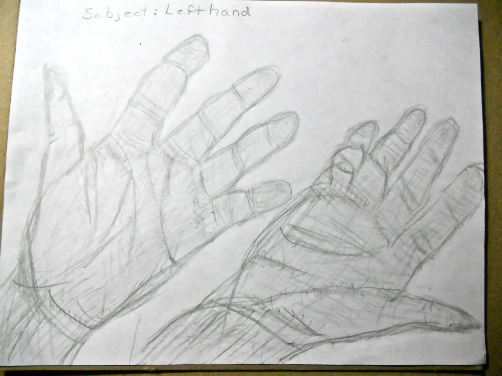
Left hand

I feel I did better than I thought I could, even using my dominant right hand. I used pencil, as a inexperienced artist, because I learned from creating the value scale, how messy the charcoal could be. It was difficult at first, the more I as sketching, the easier it became. I did some erasing to make it look better, but too much would take the lines away.
I think this was a successful study because I was forced to use my non dominant hand, a tool I would not have otherwise used. I completed a task and learned how difficult/easy it can be to use my left hand. Maybe I should try eating that way, and may not eat as much then.
The two sketches definitely have their differences. My lefthand looks more realistic. I was able to control the lightness/darkness with the pencil. With my non dominant hand, not only were the lines heavier, but the outline was not as good as with my dominant right hand. The curves were harder with my left hand, also.
I may use my left hand again in the future for artwork, depending on what is required and how much practice I have. Just like learning with my dominant hand, it takes time and practice.

Left Hand Sketch

DSCN2283

Thursday, March 17, 2011

Week 8 Videos

I chose the two videos: Greek Art & the Human Figure, along with The Greek Awakening: Art from the 5th Century because it was an extension of what I watched in the first video “More Human than Human” and the text. I then chose Cairo Museum for the third video just because the title seemed like something that would interest me most from the list.
The first required viewing was very interesting how the perception of art from way back is the same as today in some respect. Most men still view women mainly for their breasts and private parts, and do not think they can do much, or want them to talk (reason for no face or arms on statue). What they thought was a gross exaggerated body is now a reality in America. The Egyptian slender body is hard to find in America. The text talked about the statue, Venus of Willendorf as well and why it was thought to be the first know relic. It took the Greek’s philosophy of math and science to develop the anatomically correct body.
The second video I watched, Greek Art and the Human Figure, continued about art in the 5th century , except it explained the Acropolis, pottery and the bright colors, and the development of statues with realism, clothing flowing and sense of movement in the sculptures.
The third video, Greek Awakening, talked about the Parthenon as the symbol of Greece and its perfect symmetry. It’s freize, the sculptured horseman around the wall of Parthenon, is now in a museum. I also learned the theatre at Epidavros is the largest of its kind and hosts major religious and political gatherings.
Cairo Museum was very interesting about how the Queen’s tomb was discovered and all the artifacts contained in the museum, half not even displayed. I did not know about tomb robbing or there was such a thing as a sarcophagi for shrews. After 100 years the “Kai” statue was finally put on display there.
I really enjoyed watching these videos. For me, it has been easier to understand the material than reading the text.

Friday, March 11, 2011

Week Seven Architecture Videos

The Prairie Style video was very interesting to me because I now know the style Frank Lloyd Wright’s works are called. I always liked his style, especially the windows. I did not realize all his homes were all the horizontal lines including the furniture. I will definitely go to see more of them this summer.
The Classical Architecture showed the 3 orders of columns in the Greek style. I even picked out some at church on Wednesday, they were Iconic. It showed how much we use the Greek and Roman style architecture. The vaults, columns, arches are among the commonly used styles. This video also showed how we use modern mixed with classical architecture incorporating skylights and solar heating. I was surprised to see how Prince Charles crusaded to return to a more classical style.
The 3rd video revealed many interesting facts about the wind tunnel tests a building has to go through to pass. I also did not know how far a tall building actually sways. It also showed details of a smart apartment, many of which I have already seen at the Horizon home shows in the area, particularly the timer to turn up the lights in the am and start the coffee, as well as draw open the curtains in the morning. I liked how the vacuum stops when the phone rings.
The text touches bases on all these facts, but the details are more real and seen in action. I enjoy viewing the videos, just can be very time consuming. It commented on how much we use concrete and cement in our construction of buildings along with the process to make it.
I picked the video, Last Call for Planet Earth, to view because I was interested in the green architecture that is becoming popular today. It was very difficult to understand the first half because it had to be read (different language) and it moved to fast. The wording was hard to read because of the background. The Chinese man was better, with the view that ecology and economics play a role in the architecture. The fact that we all have to be concerned with the future by conserving today is hopefully becoming a reality with the new structures and its locations, using the land, air and water.

Sunday, March 6, 2011

Installation Art Project

Laura McCarthy Irish Heritage Porcelin, glass, photography, fiber, sculpture, graphic design March 2011 7'X 10’


Installation Art Project

Laura McCarthy "Irish Heritage” continued

Installation Art is a creation using space (all around you) and perception in 3D with ability to enter, explore, experience or reflect upon. It is site specific. Can be many materials. I had to laugh when in the video when they mentioned macaroni, it reminded me of a 5th grade teacher that all her students for years did a macaroni cigar box. I did not know then that was “installation” art. Glass is among the most popular material. I did not know why until viewing the video. It can be mixed media, using collages, no limits on theories, and political and social activity playing a role in creation.
The book explained it and used examples, but the actual assembly and reasons were very interesting. My favorite as mentioned in the video I previous blogged was The Richard Wilson’s piece She Came In Through the Bathroom Window You looked into an oil tanker (outside to in).
Some installation art can take months and is only temporary sometimes. To me a good example is the home show, building a small home just for the 10 day display. It is worth it to do for the value it expresses and getting the public’s attention and or business.
I named it after my husband’s heritage and way of life that I also have adapted over the years with him and other friends. The welcome sign at the top have angels with a green background to welcome guests to our home. The Claddaugh is a symbol of friendship, loyalty and faith. The flag depicts the colors and shamrock. The angel and Bellick Nativity Set on table exemplify the religious beliefs of the Irish. The Dancer ornament in the wreath stands for the 3 years my daughter took Irish dancing. The framed MCCarthy picture explains the Gaelic meaning for the name. The framed photograph of shamrocks was a wedding present,done by a local artist in Ellicottville. The leprechaun and good luck pair are my husbands and my symbols of luck from our past and finally the framed pictures are of photos of his nieces and nephews. All these art works are symbolic of our family and friends that are always welcomed here and feel free to express their heritage.
The color used is obviously green and plenty of it. The shamrock lights represent rhythm, texture shown on stuffed animals and leprechauns. The space and site specific is the fireplace wall and out from it on the sides, in the living room where we spend most of our time. The shapes are heart (shamrock),oval and squares with an overall shape of rectangle on three sides. Emphasis is the Irish with the harmony of various mainly green and white pieces in variety of shapes and sizes. The statues and dancer ornament are small in proportion to the large flag, all in unity with the Irish symbolism.
I enjoyed doing this project, just getting it all in one post was an issue and the video did not copy correctly the first time. I already had some of these articles out all the time, just arranged differently, then the others were brought out for the St. Patrick’s holiday which gave me the idea when I watched the video on installation art and saw the wall with the various pieces arranged in the box and on the table.

Friday, March 4, 2011

Peer Review

I have enjoyed viewing other students work right along. It just took more time to critique and comment on it.
This art work is not anything I may have stopped at if I were here except for the zipper art, which is awesome. Reminded me of safety pin jewelry. None were the same, mostly because we were not at the same gallery.

Lindsay did not go to a museum, so I chose another student’s work. Her pictures were very clear and colorful with a lot of meaning and expression, especially Unity. Many of her pictures could have other elements and principles just like mine and everyone else’s. For example her harmony was very colorful. The waterfalls could be movement, she used in for rhythm. I liked all of them.


Christine did 3 of the same as I did, only I was connected to 10 Formal Fingers being in the Cosmetology industry and she was disgusted by it as was someone else. I did like Child’s Blue Wall when I seen it at he gallery, just did not use it in my presentation. Her pictures were similar to mine in that we both shot some outside ones on what looks like the same cloudy day. She portrayed the elements and principles correctly in my opinion.
I only had one person comment on my blogs and it was a positive approval.
My only problem with this assignment was trying to find someone with both assignments completed to comment on.

Installation Art, Glass and Sculpting Video Reviews

Through the Eyes of the Sculptor was informative about the process of turning limestone into statues. It was very detailed about Emanuel Fillion and his work, as well as the steps from obtaining the stone from the earth and transporting it to the finish sculpture placement. It not only is the art of sculpting, but sketching first. I was intrigued by the work that goes into the making the small size one first, then the cast to pour the actual material in. I also found in interesting how they add the stack of blocks under the horses leg not just for the installation of art, but for total support. The text went into some of the detail and showed the process in a smaller scale.
Installation Artvideo showed various examples of this type of art. Richard Wilson’s She came in through the Bathroom Window was my favorite. It explained how the window is used to look at an area in a different way. It’s placement was the whole meaning to the effect. I seen how the whole building is the actual artwork and learned that is what installation art is, helping to verify what the text also explained. This is definitely a creative way of doing things. It seems to me to go from one extreme to the other as far as what can constitute “installation” art.
GlassWorks video was my favorite. Someday I may try this art. The video made it look so easy and I know it is not. The text explained it somewhat and the movie showed much more about the whole process in detail. Growing up in Our Lady of Victory Basilica, I have always appreciated stained glass windows. Some of the websites students chose to show art with glass were amazing. Corning Museum experience also taught me how hard it is to stretch the hot glass to sculpture a flower. I never realized how much glass is used in our lives and why until viewing this clip.

Sunday, February 27, 2011

Albright Knox Art Gallery Visit

I enjoyed spending my vacation day at the Gallery. I went myself and glad for that enabling me to observe, take notes and see just what I wanted to see. Not enough time to stop at every art piece. I tagged the photos in photobucket with impression, connection, and know more about. I also put the artist’s name, media, year and scale in the description, but none of it shows in the blog view of these works. I had to enter it here.
The three that made an impression on me were:
1.Colors Cool by Mariko Mori, 2002 Photopainting I thru VI edition 3/3 Prints and Lucite with Dye destruction. This attracted me because of the irridescent color, round frames, as well as the three dimension art that diplayed different jelly fish/sperm like shapes and sizes. It was unusual in art form, which seem to be the works I was most drawn to. I would also like to know more about this work.
2. Jess by Unentitled Graces 1978 Paper Collage. It was 100 years of artwork consisting of puzzles, pictures of food, animals, science, landscaping, new and old, and mostly square and round shapes within. The hands in there seem to represent the hands of time.
3. Tow - Path at Argenteuil ca 1875 by Claudia Monet Oil on Canvas. All of Monet’s works are of my favorite colors, the outside, beach, flowers, and nature that seems to appeal to me, just like Thomas Kincade’s work.

The three that I was connected to was:
1. 10 Formal Fingers by Jim Dine 1961 Wood Relief with Oil. Nails and skin are part of the Cosmetology curriculum that I teacher is why I was connected to this piece.
2. Hum by Robert Long 1988 Plastic, formica, wood audio jacks, chrome-plated steel aluminum, plastic bonding and lacquer. Electricity is my husband’s career and this work really intrigued me. It also looked very much like some of my contraptions with all the cords to my theatre/stereo hookups.
3. The Marvelous Sauce by Jehan Geroges Vibert ca1890 Oil on Wood attracted me on the wall and at the post card rack. I am connected because my neighbor is an Italian cook and making sauce all the time. This painting has some humor in it and was fun to look at, just made me hungry after viewing it.

The three works that I want to know more about were:
1. Janet by Chuck Close 1992 Oil on Canvas. This was one of many art works displayed as part of the optical reflection. It all seemed interesting, this one was pictures in a picture much like the puzzle I have been working on. The DNA fingerprints in this display was something I wanted to learn more about.
2. Morning War 2008 by Matthew Ritchie 2008 Oil Marker on Linen, video, paper, sculpture on wall and floor. I was intrigued by this piece as soon as I seen it and wanted to know more about not only the work involved but also the meaning. I could not get a picture of this,so I took a picture from the video that is on the Albright Knox website to place in my blog. After viewing that video I did learn more about the art work.
3. Pinwheel by John Ahearn 1998 Plaster. I wanted to know whose arms they were that were linked by the thumbs, and why. It seemed to me it represented unity amongst a group, whether it be race, nations or a support group of some sort.

Friday, February 25, 2011

Logo process

Week Five - Art Making/Material Exploration #2 Logo Design


A website that I can not seem to paste here from Illustrator is how I learned to make a pair of scissors. After trying it on Illustrator, I tried sketching it myself.
It took so long just to figure out how to operate the tools in Illustrator and downloading the program. I watched all the videos and even some of the tutorial’s in Illustrator. I also checked out all the links for Logos and after many decisions in this process, decided my original design.

I did my best to sketch them out and color them using blue, green, and pink inside the blades, outlined in silver. Looked good so I captured them with my digital camera and uploaded into Photobucket. I did not like it then. The colors did not show up well, so I played around with some edit tools in Photobucket. My slideshow shows a few of the many ideas I tried. I know at staff development days, we learned some Photoshop, and advanced techniques in other programs, but I definitely need more time using Illustrator.

I thought this would be easy and fun. I tried long and hard to use this program with no success to draw a pair of scissors. I then typed my words in there, with no luck saving them to put on the blog, so I redid it on Pages. I took the pictures from Photobucket, made a slide show and now trying to embed it my blog.
The videos were very helpful and I am sure if I was not so determined to do a scissors with the words in the blade, I may have done something else. I see what a graphic designer does all day and the competition is so great. The Super Bowl commercials all started with one sitting at the computer with the thought process rolling. The videos all showed to use the elements and principles of art to think, sketch and design your idea. Experiment with various font size and style also to come up with one clear concept.

Sunday, February 20, 2011

Color Wheel and Value Scale

The most difficult part of this project was trying to attach the photos and as of writing this I still may not have it done.
I had a hard time decreasing the darkness of the values in equal amounts. I then did the color wheel went ok. I then tried to write the blog, but typed it first in the wrong box, then lost it somehow. I retyped it in here and can not remember my blog account password to upload my photos. I have spent all evening on it, now it is 11:20 and going crazy.
I liked working with the graphite pencils the most because it was something new and different. I do the color wheel in my hair coloring class with the students.
The most important discovery I made with this project is that magenta, cyan and yellow are the primary colors and not the red, blue and yellow as I learned. We teach the original primaries in hair color to achieve brown, but if we want dark black hair, then I suppose we should use more magenta.
I enjoyed the video because it showed how detailed and precise to be with the pencils in the value scale. I also was able to start and stop it at any time for reference when doing the color wheel and scale.


Saturday, February 12, 2011

Photobucket Experience

What seemed to be easy at the beginning of this week, is a nightmare on Saturday. My computer skills are improving greatly, but not the best. It was no problem setting up the account on Photobucket. I then snapped various pictures to put on the computer. Not an easy task, Hard to choose what to photograph.Then, I could not import them onto my daughter’s Apple computer. That evening was totally wasted.
She showed me how to do the import the next day, only to find out some of the snapshots taken said “No file data saved”. This is a new camera and do not know what this means. The picture shows up on the camera, downloads on to the computer, but when I try to save them to Photobucket, they did not save. It commented “files not saved”. Ugghh!!
I took more pictures, made sure they worked, then put them on Photobucket. Hooray, I did it!!!! Now I have to pick which ones go with the proper element or principle. Decisions, decisions!!!! Ok, I finally did that only after I closed the wrong window a few times and had to get the wireless mouse out because I am not good at the little control pad on the Apple. Hours later I have the pictures in tack. I set up the slide show. It is now Friday night. More decisions on which way to present them. After I picked one, I can not fiqure out how to embed it in the blog. Help!!!!
It is now 3:31 pm on Saturday and frustrated. I am not sure which way I am supposed to “share “ this or how to get it onto the blog. I have learned more than I can absorb right now. I will have it in here someway, somehow and hope it is right.

Friday, February 11, 2011

Week Three - Blog: Color Theory and Emotional Effects

 Color is the reflection or refraction of light depending on if it is a subtractive or additive. It is used to express emotions and feelings. Red represents blood and can make someone angry, yet it is used to express love. Blue is serene but depends on the level of intensity. It also depends on the context the color is used and its border next to another color, whether it be warm or cool.
The most fascinating aspect of color I learned from the resource was the length of the border technique in a painting as well as the value for effect. For example, the red interrupting the blue serenity. I do haircoloring and understand some of the warms and cools, complimentary colors, but the interactive tool was fun and very helpful.
 In the Color video, the way June Redfern used the color as she went along, splashing it on and then removing it impacted me more than the actual colors she used.
In the Feelings video, I learned alot about the two artists and how different their thoughts were and how they expressed them. The colors Goya used were more vibrant and David used softer colors. The colors Goya used to express more anger and meanness were vivid and darker than David’s choices. It was interesting how the shape of the bodies changed the message too.
http://www.blogger.com/post-create.g?blogID=3661302792757556486

This is my slide show for viewing.
http://s1237.photobucket.com/home/lbmccarthy56/index

Friday, February 4, 2011

Blog 2 video reviews

http://www.blogger.com/post-create.g?blogID=3661302792757556486

 Each video spoke about the aesthetics of art and the theory behind it. The first one mentioned various philosophers'  theories on the art and the second one gave 2 scientific views behind the conception of a art piece. Both spoke about harmony and symmetry in what the brain views.

I felt the 18th century philosopher, Francis Hutchinson, was important because of his belief that God is the sign of harmony and all is good and that is beautiful. The inner sense of beauty is spontaneous and one must be knowledgeable to appreciate the aesthetics of art. 

Changeux and Ramachandran both viewed the aesthetics and art as being scientific. It is how the brain is wired according to Changeux. He gave very detailed brain diagrams and explanations to his theory, talking about brain synthesis and restrictions. Ramachandran gave a more lighter, funnier version of how one sees art. Ramachandran's  8 Laws of Aesthetics explained some of what we are reading in the book, such as the symmetry, contrast, as well as groupings in species, societies or across time. The most interesting fact from Changeux I thought was that the brain synthesis of nested processes takes 15 years to develop. Ramachandran remarks about the one region of the brain that extracts one thing about an art piece and gets rid of the clutter.

The videos mentioned what we read in the text, only elaborated in a more scientific manner and very detailed. They gave other opinions and the power points are instilled in my brain, so now I will look at art differently.

I thought the films were educational, but Changeux was too hard to understand and I missed some important words, even after replaying the section. The videos gave me better understanding of how the brain receives the art viewed and explains more about the aesthetics of art than the book. 

Tuesday, January 25, 2011

Reflections of Art Class

The blog was more confusing because I was not sure if I did it right or not. Hopefully the Gmail and Blog is done correctly.
I expect to learn as much as I can about the different artists and the messages in their work that has influenced our culture.
I feel the online works for me because I can do the work late at night or weekends, whenever I am in the mood. Just have to focus more, but the discussions help.